Role: Art Director, Copywriter & Strategist
This project was a deep dive into translating Google’s core brand identity into a cohesive poster series. Tasked with aligning visual design with specific corporate culture, I chose Google to explore their iconic use of color and playful design language. The objective was to maintain the brand's recognizable, vibrant aesthetic while pushing the boundaries of their visual system through experimental layout and composition.
First Draft
While my initial drafts established a brand-consistent aesthetic, I evolved the series by implementing a modular grid system. This structural shift allowed me to break away from static layouts, creating a more dynamic hierarchy that balances bold typography, photography, and the iconic Google identity.
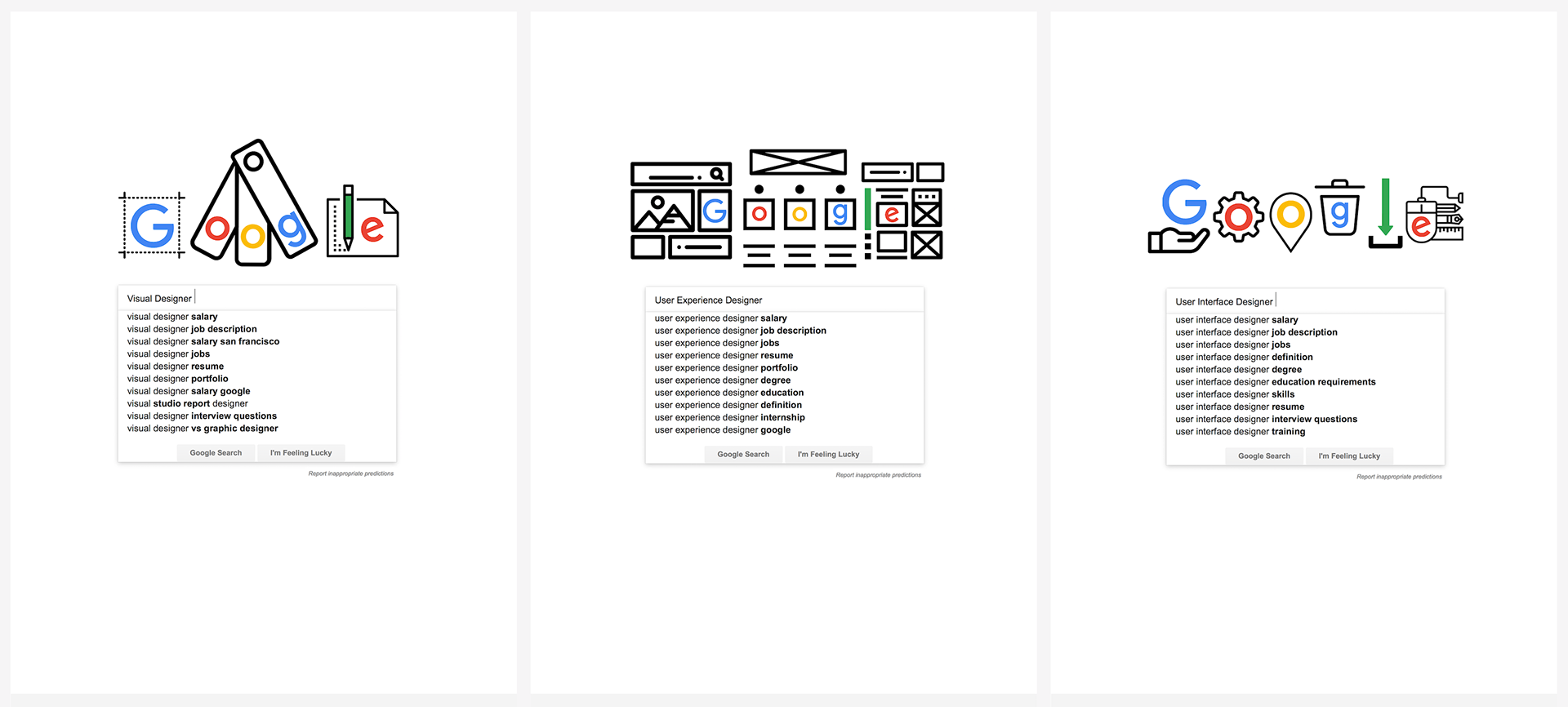
First Version of the Project
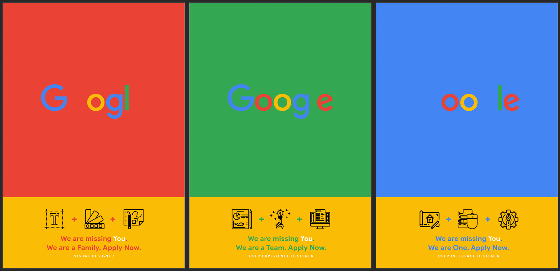
Although they like the background colors that I have used, they are not sure about the missing letters of the logo if it will communicate well with the audience. I addressed this feedback by playing more with the layout and incorporating grids to ensure better communication.
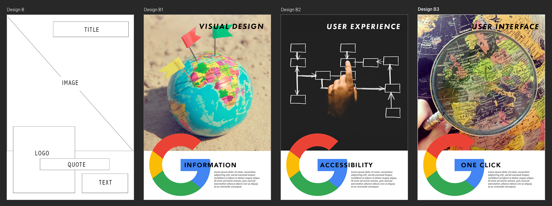
2nd Version of the Project
After reconsidering the feedback, I decided to create a new layout. I chose to play along with the Google logo as it appears on their search page. My reason for doing this is to have a clever idea that reflects how the Google search engine already knows what you are looking for—which is exactly what Google is.
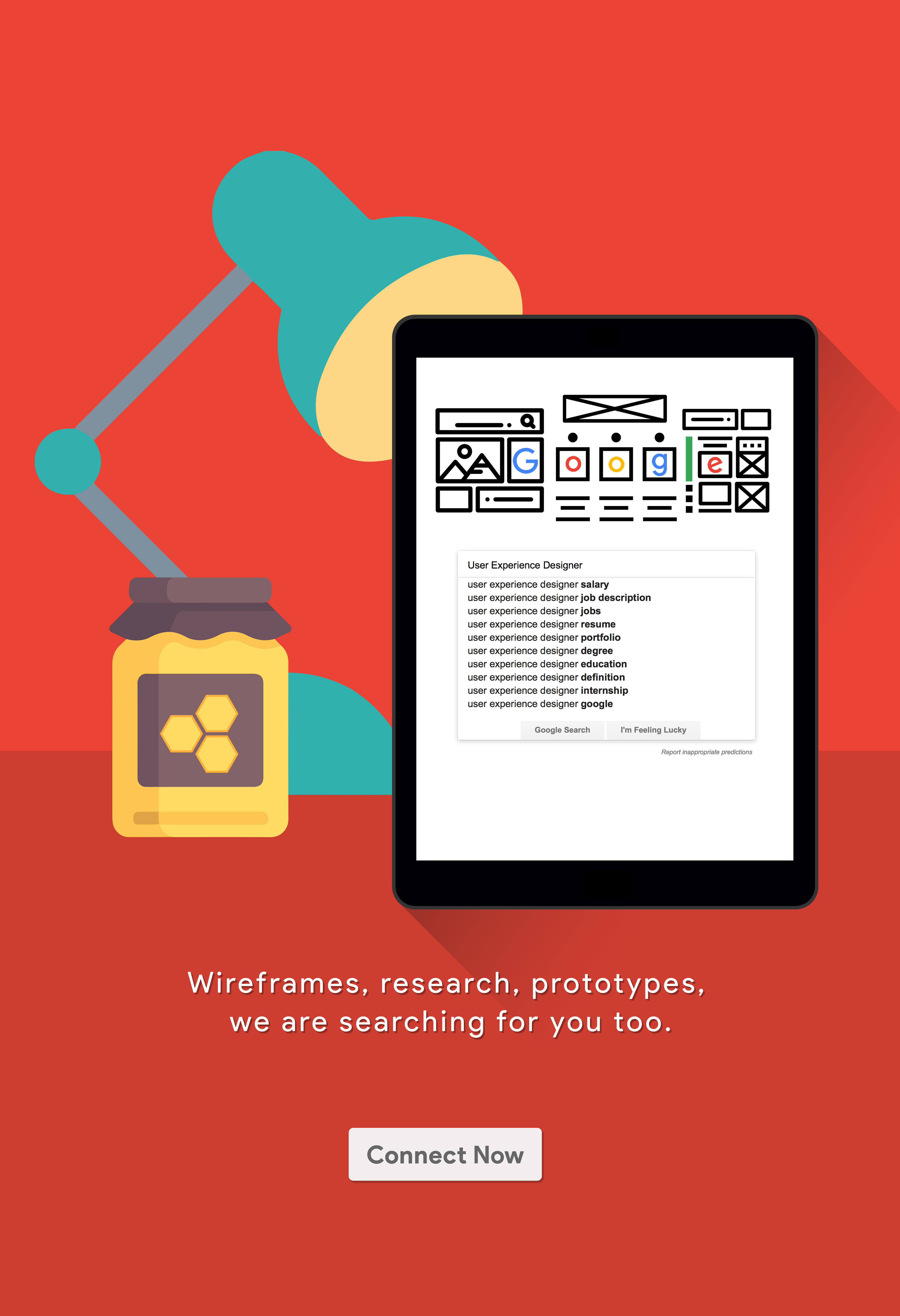
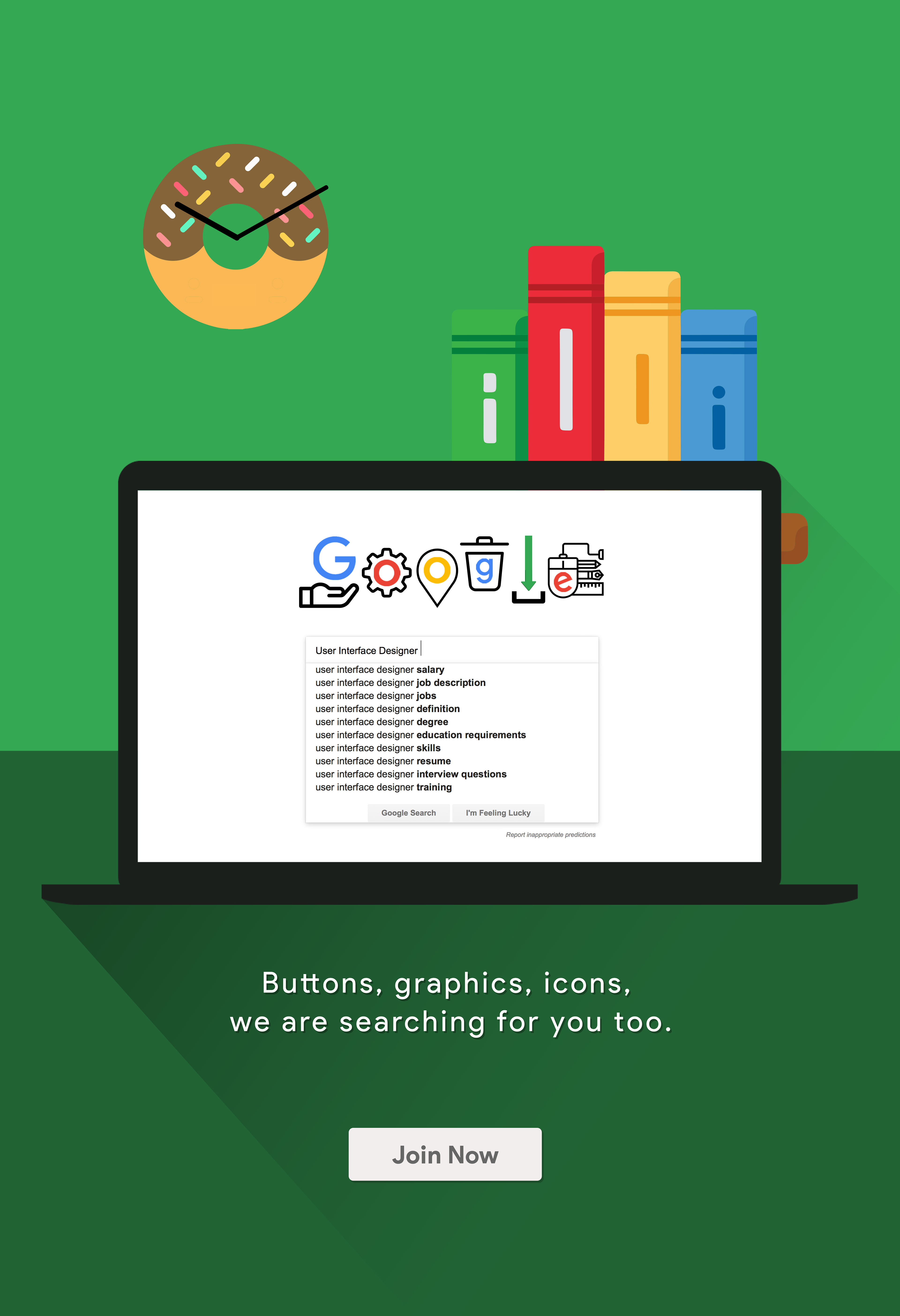
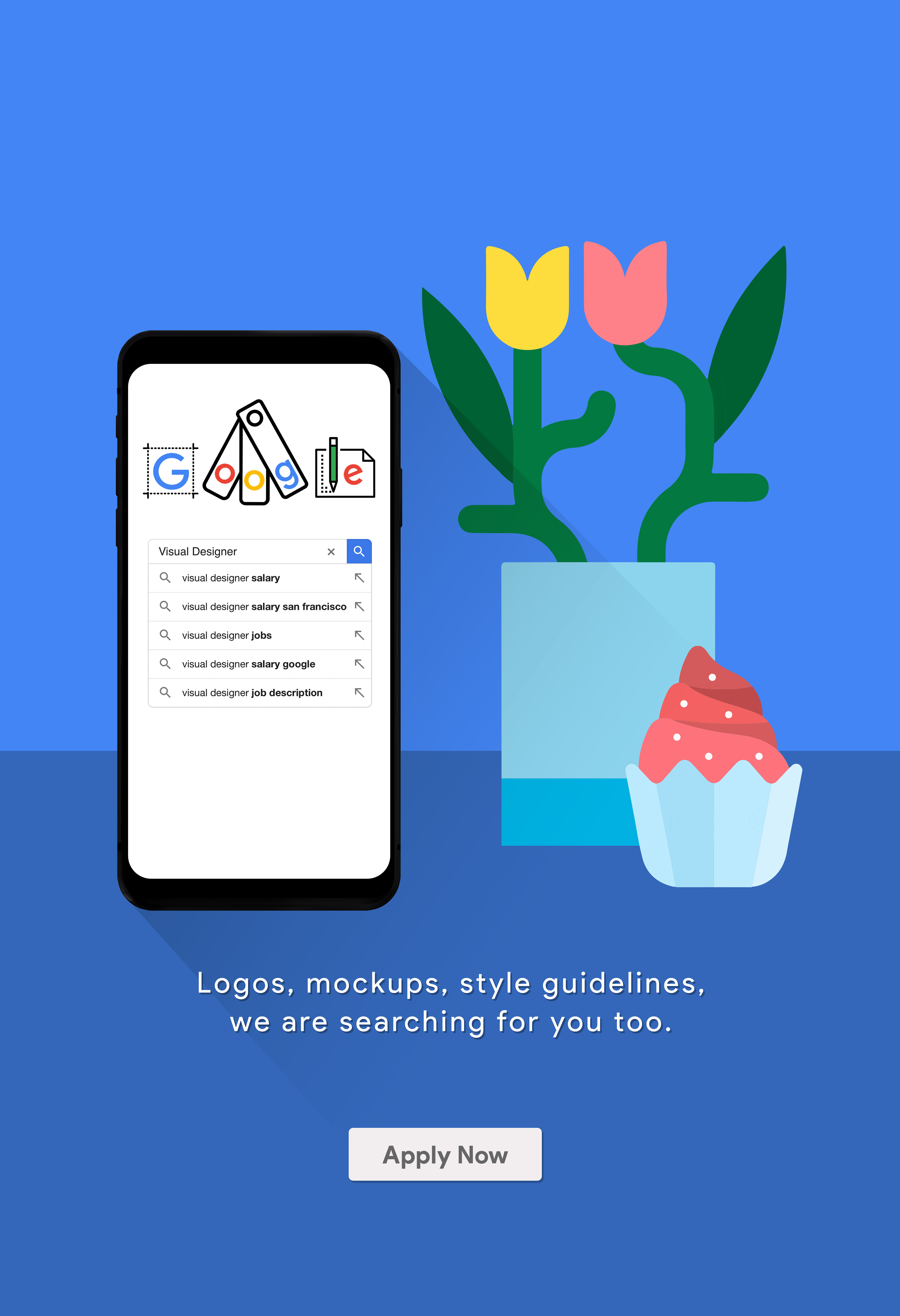
Below, you can see how I created these pages and incorporated them into different devices.
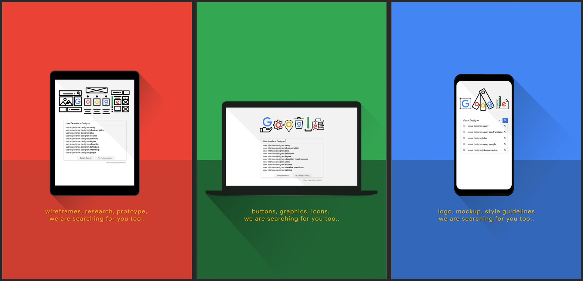
Feedback: This version was well-received for its effectiveness in communicating the core concept. The next steps are to refine the design by adding a call to action and pushing the playful nature of the visuals even further.
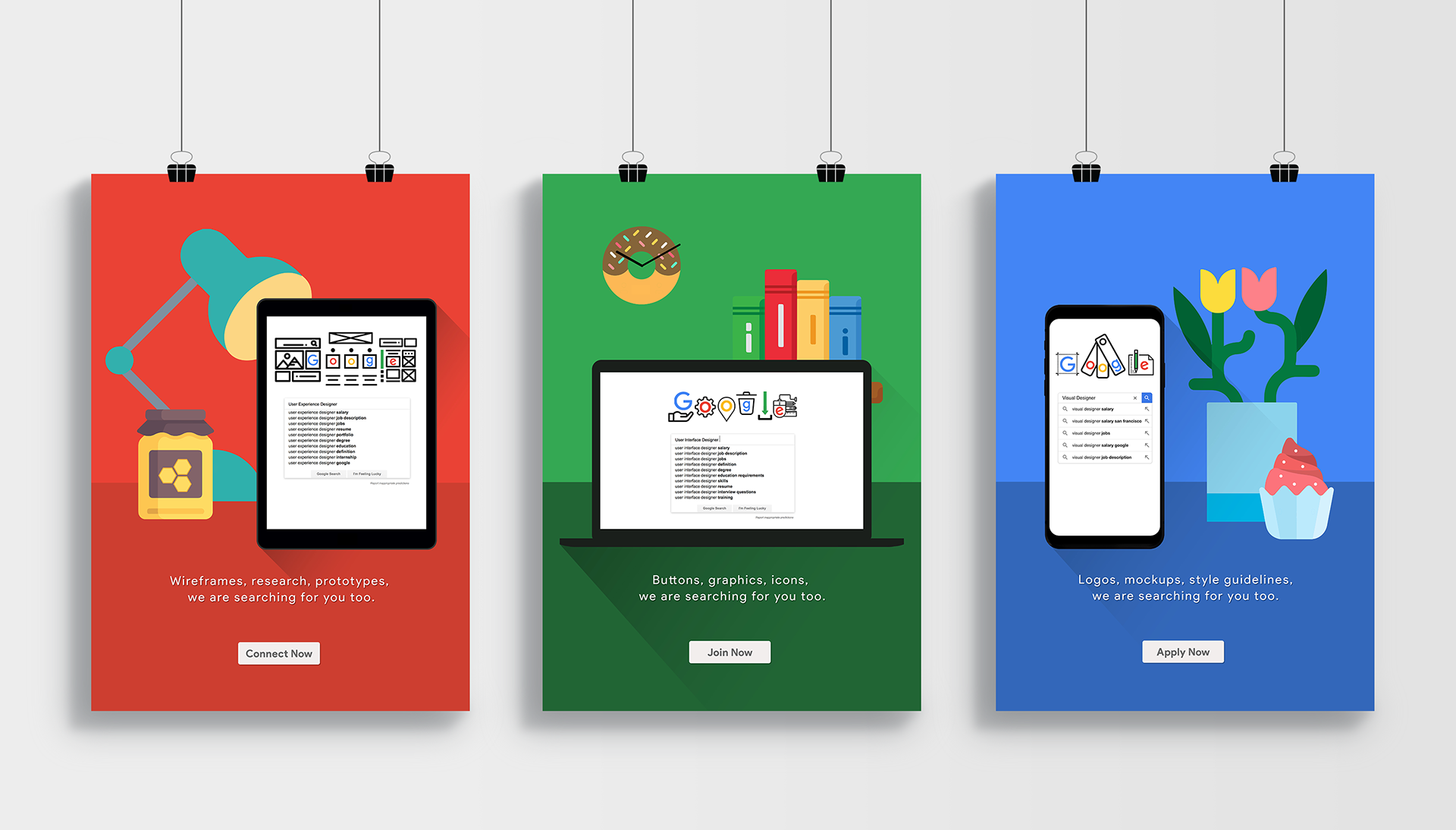
Final Version of the Project
Taking the final feedback into account, I focused on enhancing the playfulness and brand alignment of the series. I incorporated everyday objects found in a home or workspace to create a relatable environment. Additionally, I integrated references to iconic Android Operating System names—Cupcake, Donut, and Honeycomb—to deepen the connection to the brand. Finally, I added a call-to-action button, which effectively completes the design.
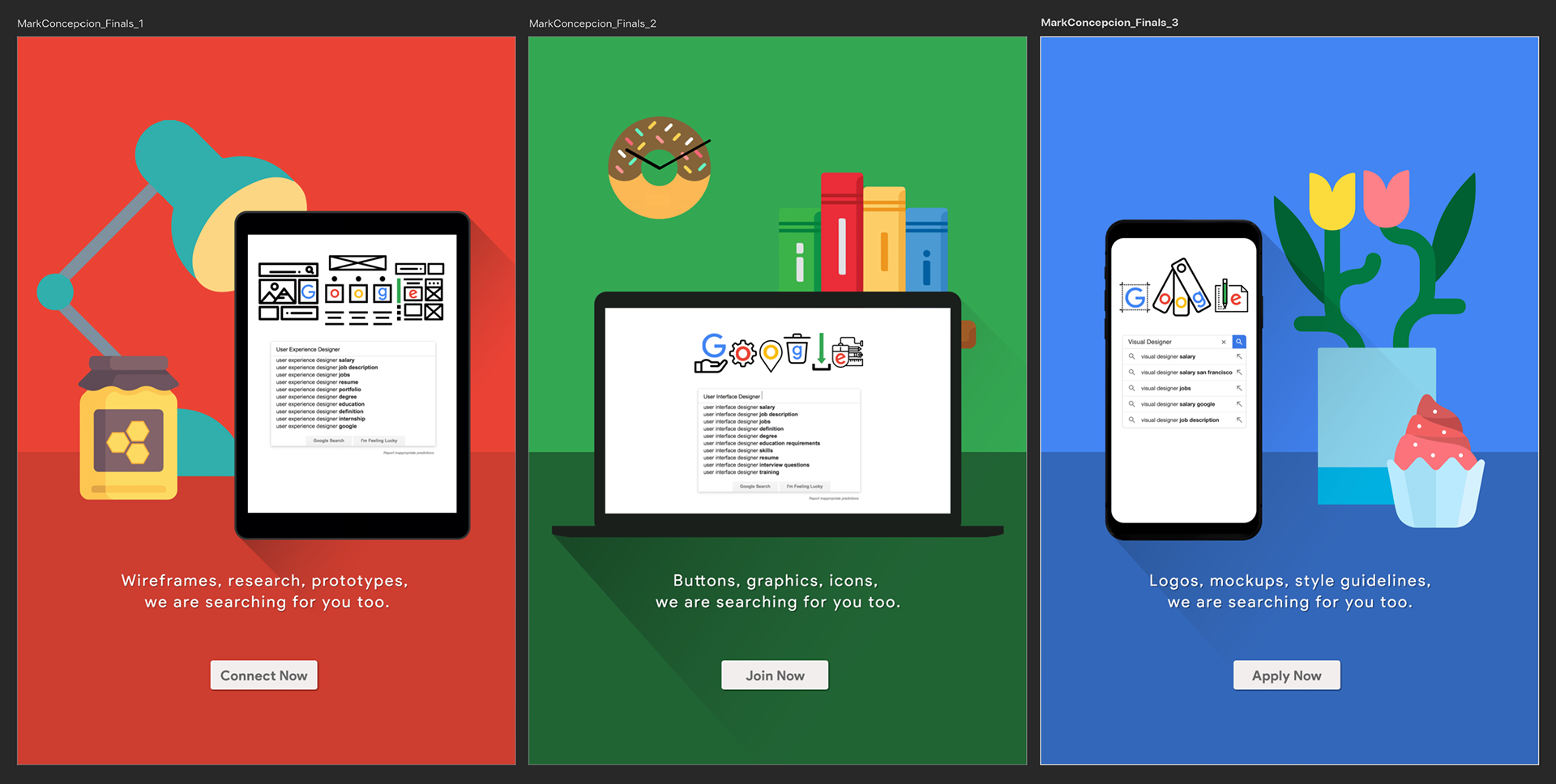
Feedback: They really appreciated how the posters’ playful tone effectively captured the company’s identity