
This a project about creating a book layout for a given content. The task that was given was to be creative and playful with the concept that will match the subject. The Project is about how IBM defines color.
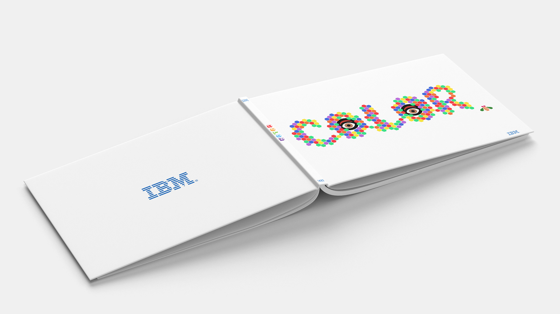
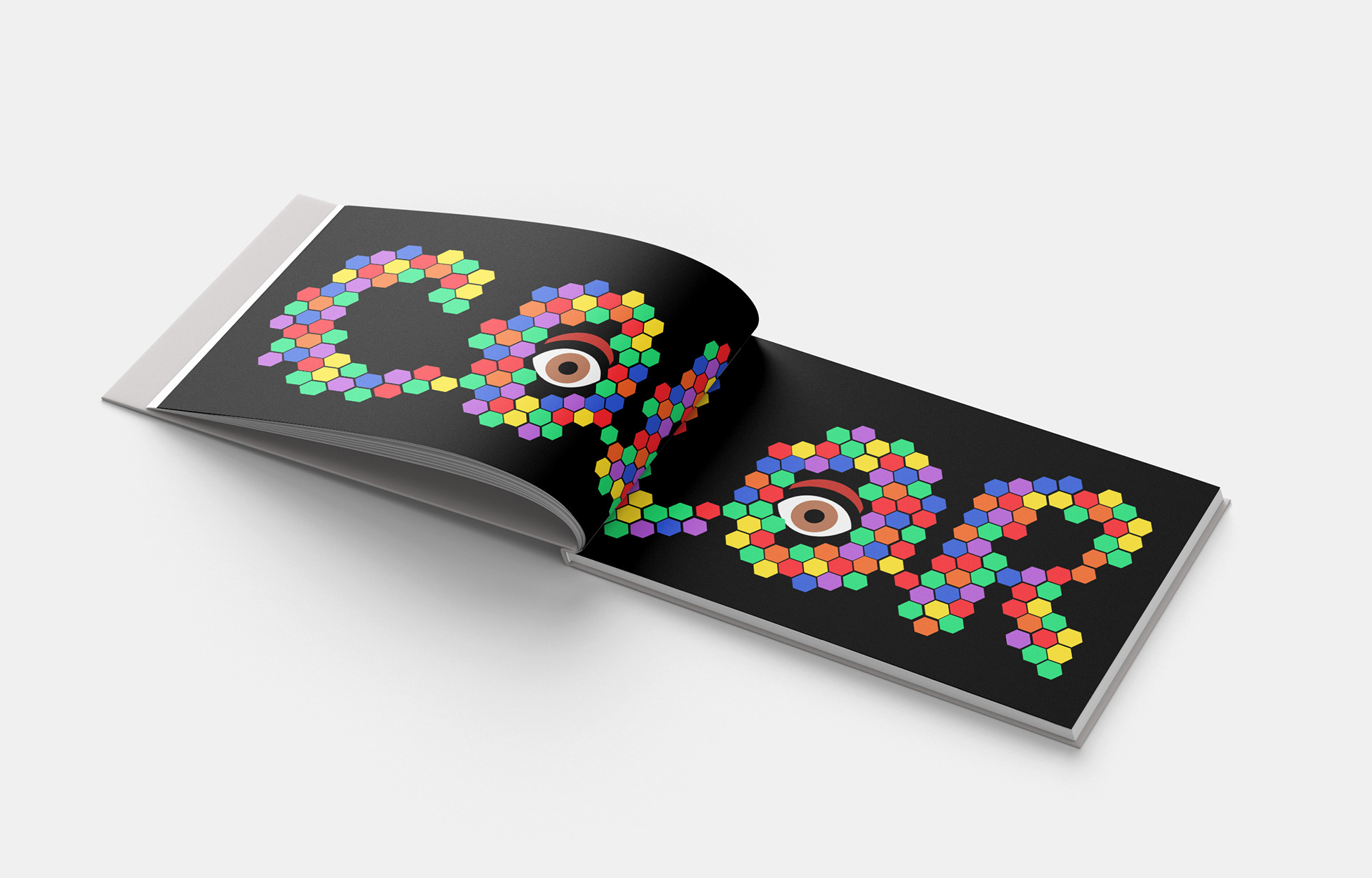
The inspiration of the book cover came from one of the Graphic Design logo of IBM, which is the bee.
I used the concept of how bees produces honey and relate it to how colors are made.
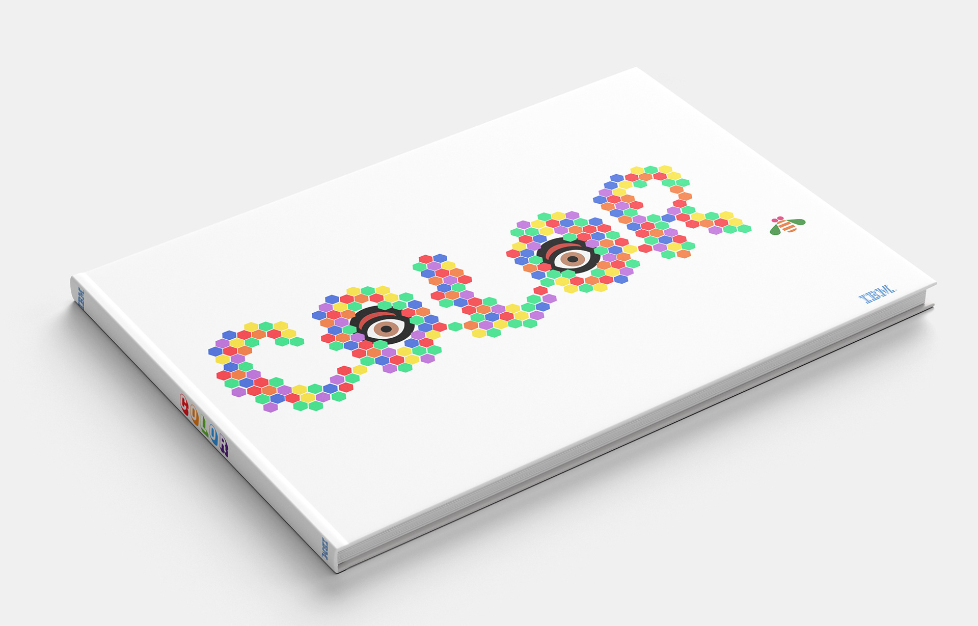
With the visual style, I maximized the use of colors and applied it to over all design and feel.
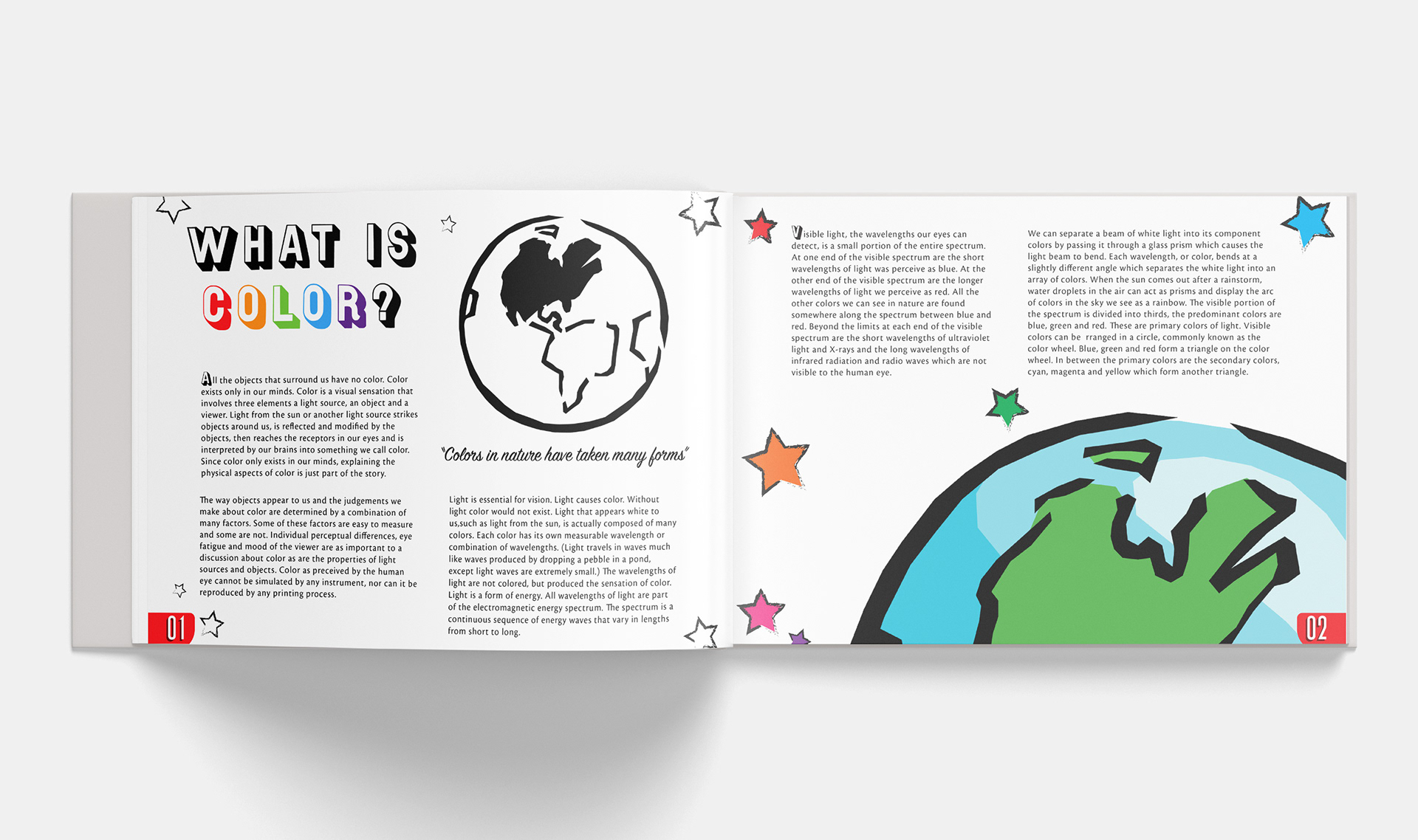
Above: I started with the concept of how Earth looks like without a color. I remember when I was a kid, I've read a story how God painted the earth with colors from the first day of creation, upto the last day.
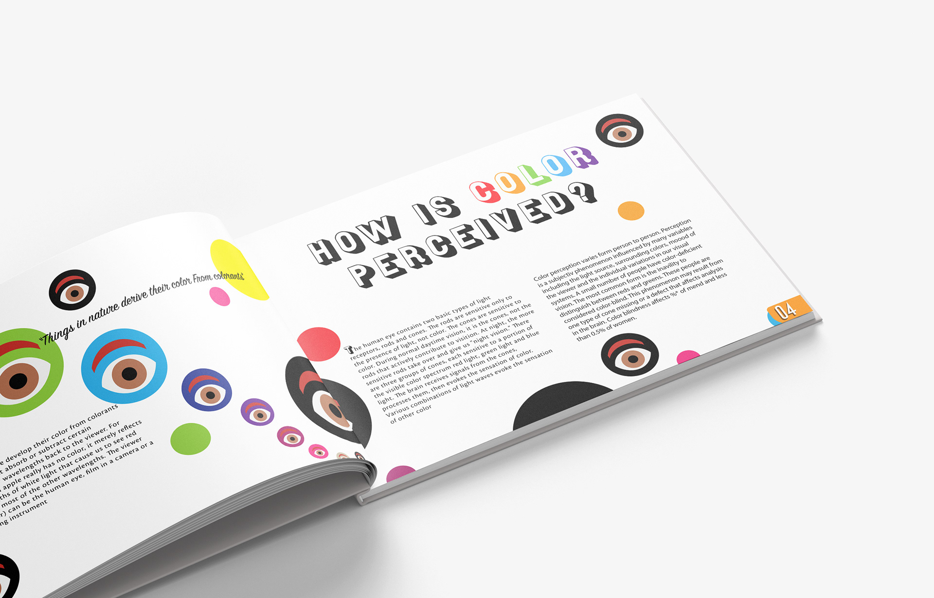
Above: On this page, I used the logo of IBM which is the eye which I think is perfect for the topic,
"How is Color Perceived?".
In this part of the book, I decided to introduce how colors are different when it is dark or light.

Above: With the book summary, I gathered all the design elements that I used.
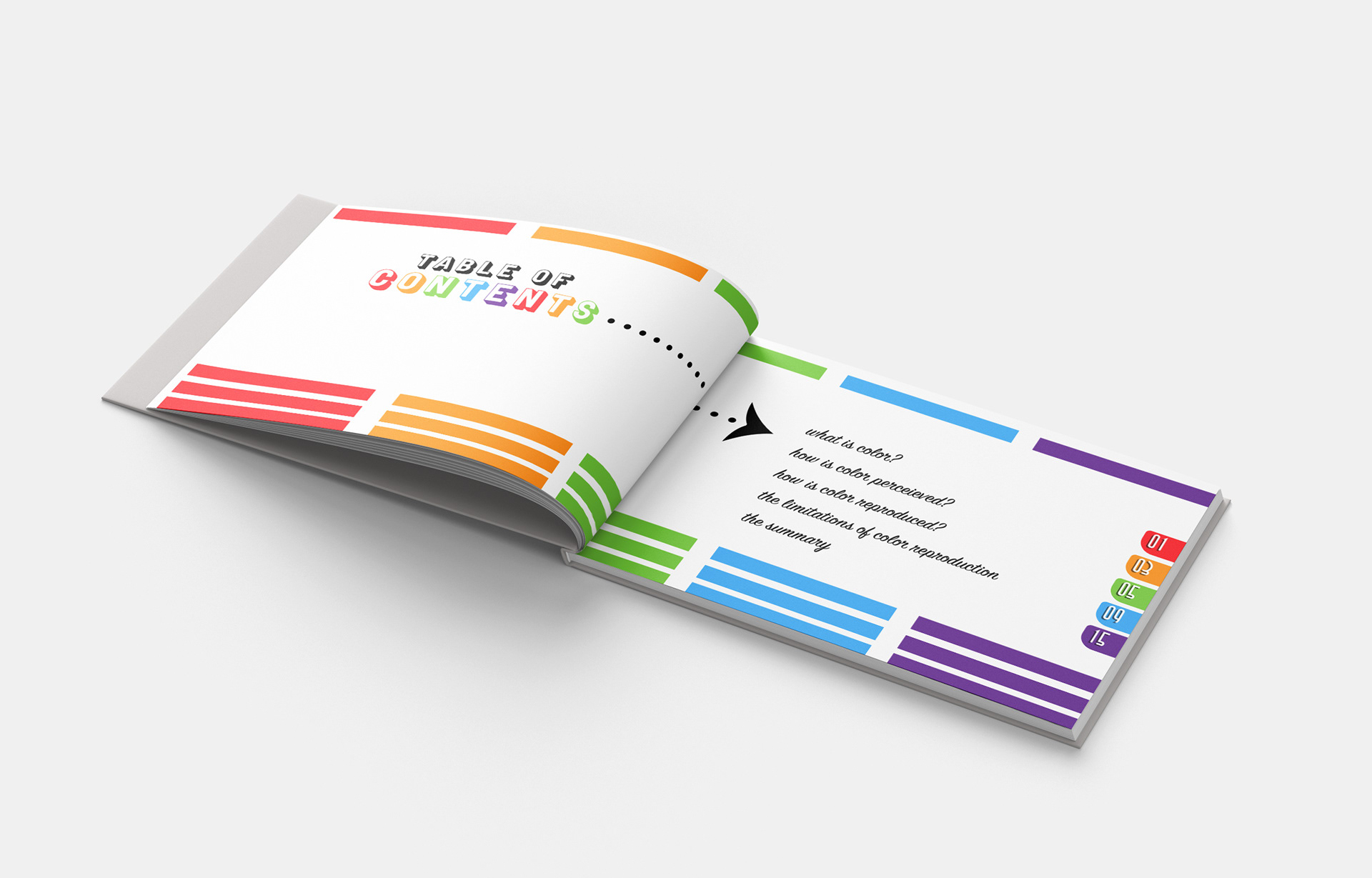
As you can see, the colors of the page number are based on the chapter,
so that readers can easily navigate the book.